Thursday, March 20, 2014

Inner Child.


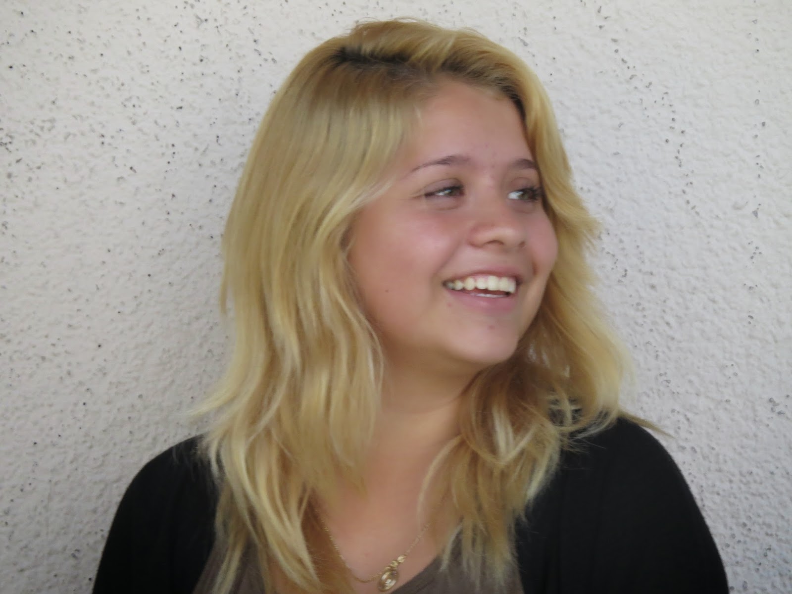
This was one of my favorites of Julie because at the moment me and Eber were saying things and she actually laughed, and it was kind of hard to get her to even smile. So i was happy that i caught this picture..

I also really liked this one because Julie isnt much of a loud and crazy person so when i told her to make an idiotic face it took forever for her to make one. When she finally did i was fast enough to take the picture because she would go back to her normal face and wouldnt hold the pose.


 I really like this one of Alejandra because it was like an off guard photo. She didnt know i was taking this, she just happened to be in a perfect position for me to take a picture of.
I feel like this picture reveals Alejandras personality/identity. She is a very goofy and fun person to be around all the time. She is definitely a weird person as well, in a good way though..


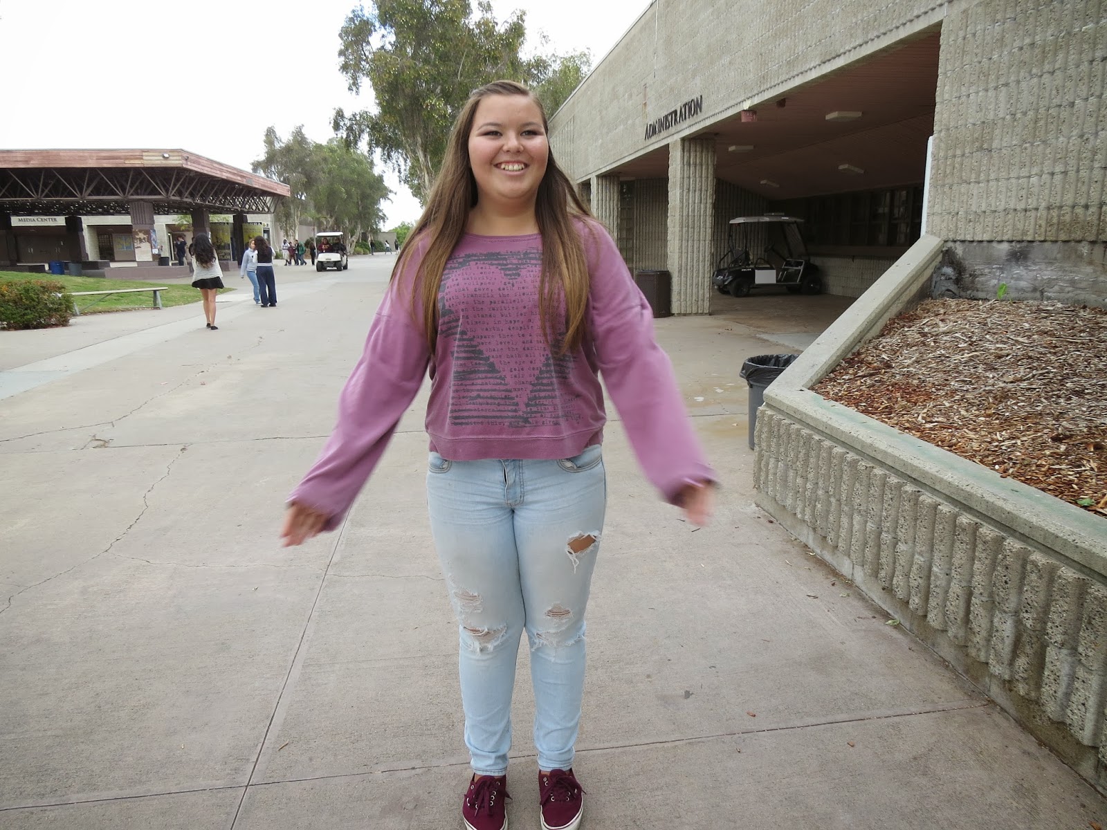
My models were Alejandra and Julie. They are both very different in showing emotions, Alejandra is more of a good model and expresses her feelings great and Julie is more of a really shy person that is nervous to pose for the camera. I had no challenges with Alejandra because taking pictures of her was pretty easy and mellow. While on the other hand, it was a little hard to get Julie to do faces and show more of her personality. Well i had great success because i was able to get all ten pictures of both Julie and Alejandra, they were pretty awesome as well. 

Well i kind of like being in front of the camera and getting taken pictures of, its pretty fun. Being a model can help you to be a photographer because then if the person your taking a picture of asks you for an example of how that type of emotion looks like, you can show them yourself. I think in order to be a good portrait photographer, you should be a little far away so you can zoom in, and then have a really shallow depth of field which makes the picture look even better. Since i like people taking pictures of me and stuff, i think I'd very much enjoy the next projects with portrait pictures or even full body pictures. Im not really concerned about anything! I love this class and Photography is really fun, i feel like a learn something new everyday, whether its how the camera works or really cool things in photoshop.


Wednesday, January 29, 2014

Framing.

MANMADE.

i saw Alejandra behind the gate and i got the idea to use this as a framing picture. I decided to just get her face because i wanted that to be the main focus of the picture. It was a pretty quick procedure since it wasn't too complicated, and the fact that she's not afraid of people being able to take pictures of her, seems like she actually likes it haha.


NATURAL.

Eber and i were standing next to each other and i saw our feet together, i thought it would be cool to just frame that with my fingers and have him take the picture. He had to take the picture because i was already using my hands as the frame for the picture.


ARCHITECTURAL. 
These small windows are connected to the 200 building so that made me think it was architectural. At i first i had someone holding the object but it didnt look so good because of the hand. Mr. Pederson came outside with some tape and we just taped it to the window, it looked much better then. Thanks for the good idea, i really appreciate it!


1) My strongest photo would be the man made one of alejandra. It's one of my favorites because theres nothing in the background that distracts it from being the main subject. It also looks really nice since it's just half of her face.
2) For some reason it was really hard for to find natural framings, because the only things i could think of were using the fingers, hands, legs. I couldnt really find framings in trees or plants, stuff like that. I just had people give ideas since i saw that they were going through this project really fast and confident.


Tuesday, January 14, 2014

Panning.

 For this photo, i had to set the shutter speed lower so i would catch the blur of the hands/ legs moving but have the face of the person nice and clear. There would be alot of times when i tried getting the face clear but the rest blurry, everything would just come out really blurry so i probably took like 20-40 pictures on just having this person walking. I just kept trying until i got what i needed for this assignment, and after awhile i got it.


The shutter speed for this one was about the same because the only difference was that the person was running/ jogging instead of walking. I had the same problem with taking this picture as the other one that i had to take of him walking. Basically i had to take plenty to finally get what i wanted or more than that.
I had two people in my picture so i could have one nice and crisp and the other person really blurry, my goal was accomplished. Sometimes i would take the picture and it would be both of them really blurry and so i had to retake it many times actually. After taking a bunch of pictures, this was the best one i had so i had no choice but to use this one.
As cars would pass by we took many pictures. Since the cars move faster than we do, my shutter speed had to get higher but not too high or else there wouldn't be any blur in the picture. Something i struggled with was getting the shot right in front of me or right in the middle, so i had lots of pictures in a not so good looking angle. Then I figured that I had to move at the speed of the car, and it worked!


Friday, December 20, 2013

Float.


For this picture i didn't really have an inspiration, like my partner just wanted to jump off of that. In my opinion, this is a nice picture. This one was pretty easy to capture the stop in the jump. Even if i did have any problems i could just set the shutter speed higher than what it was. I couldnt think of a better idea, so its simple but still a good picture.

My inspiration for this one was for her to look like she's about to fly up into the sky. I faced no technical difficulties because she was standing on a chair and i used photoshop to make it seem like she was floating. I think it was pretty creative because it looks like shes about to fly up.


My inspiration for this picture was was for it to seem like ryan was powerful enough to lift her up from the ground, it looks pretty cool. Some of the pictures came out blurry so i had to retake it like 5 times, but it finally came out good. This idea came into my head as soon as we started the project so then we decided to do it, but people were also busy taking pictures. Many people didnt want to be in the picture because they had to finish their own work.


Monday, December 9, 2013

Creative Controls


 Part 1: 
  1. Which Aperture makes a wider hole in the lens for light to come through? F/3.5 
  2. Which Aperture lets more light into the camera to hit the image sensor? F/5.6
  3. Which Aperture keeps more of the foreground and background in focus? F/11.
  4. Which Shutter Speed is faster?  1/200 second.
  5. Which Shutter Speed keeps the door in the camera open for more time? 1/30 second
  6. Which Shutter Speed is best for stopping action? 1/200 second.   
Part 2:
To me, all these three pictures look pretty much the same. I dont see any differences between them. 

Since the shutter speed of 1/10 second lets more light in, the first one was very bright. the 1/60 second was better looking and then the last one at 1/500 is the best looking out of all.


when she was moving the 1/10 second was too slow to catch the motion clearly. Using the 1/60 second was much better but still didnt get the motion to stop in the picture completely. Finally the 1/500 second surely caught the motion, it even looks like she wasnt moving at all.


The first one was taken at 1/10 second, it didnt catch the motion clearly or ad good lighting because it let too much light into the picture. The second one was taken at 1/60 second, it was better looking but the lighting was still to bright there. Third picture was taken at 1/500 and it caught the motion to stop, so its nice and clear, also the lighting is now good because its not too bright nor too dark.


 Part 3:

 1) To me depth of field means what part of the picture is not blurry and focused.
2) you'd use a wide aperature when you want to make the background of the picture blurry, but you would have to back away from the object and zoom in for that to happen.
3) when my partner and i took panning pictures, the 1/10 second let too much light in and didnt stop the motion. But when the shutter speed was 1/500 second the picture's lighting was nice and clear and the motion was stopped.


Friday, November 15, 2013

Patterns

 I like this picture because there is a continuous pattern of blue rectangles/sqaures, and theres only three of them. Its a simple but just like Mr.Pederson says it's clear and crisp. This is one i didnt have to crop or do something to it on photoshop and actually came out to be nice.
 I like this picture because you can see the pattern of the bench's legs, its a pattern that doesnt stop unless there are no more benches. It looks nice because it was sunny that day, it wasnt gloomy. Ive noticed that i take much more better pictures when the sun is out and the weather is warm.
 I think this is my favorite out of these four pictures i chose. To me it looks really cool, like almost as if the leaf is symmetrical. Theres not much of a distraction in the back, so the main focus of this picture is absolutely clear.
I liked how there are some random yellow spots on that part of the tree, it makes that pattern that i was looking for while taking pictures around school campus. This one i did have to crop because there was some people in the back, so i used the filling the frame technique we learned a few weeks ago in this class.

Some skills that i have been doing well and really like doing is filling the frame. It makes it a much better picture, because the main focus is that object you take a picture of. And also to me it just looks nicer because then theres no distractions in the back whatsoever. For our next project my goal is to start using other ways to take pictures instead of just filling the frame, because the same thing can get a bit boring. I might start using the rule of thirds more. Mr.Pederson has already done a good job with advising me more on how to take better pictures or go on photoshop to make them better.

Thursday, November 7, 2013

Photoshop Tutorials.

 I found this one to be somewhat easy because the eyes of the cheetah actually kind of matched with mine and that made it easier. the problem was that my eyes were too small so we had to stretch each eye out. I liked how this picture turned out to be funny!
Well since this picture, the koalas eyes were too wide from my eyes so i decided not to include them at all. It kind of looks real to me, like if there was no photo shop included that's why i like it. These pictures where one of my favorites because they were nice and simple.
i used the eraser, i realized that i shouldve used the brush but i had no idea how to do it and thats why it looks bad. now i noticed that the nose of this leopard isnt matching with mine and that looks weird. If i had time i would redo it but this is due today! These type of pictures were the most challenging for me honestly.
Again, for this one i used the eraser. But i really should have done it with the brush like Mr.Pederson demonstrated. The nose isnt matching with my nose and it looks totally fake. Well, at least now i know how to really do it, so i wont mess up the next time we do these types of pictures.
To create this image, there was alot of steps i had to follow. But it wasnt too difficult like the half animal was.  There many layers we had to add on, and then we had to use the gaussian blur. I didnt have any problems working on this picture whats so ever. I would consider using this type of effect more on my photos.
For this one i decided to add color, but it didn't really make much of a difference. Since this type of picture was pretty easy for me, i didnt have any problems at all. I like how this picture makes it look like a painting sort of.
Since the quality of this photo was originally not so good, it still didnt look good. So i had to mess with it more, and but a higher number on the gaussian blur part. No problems at all for this picture as well. It makes it look cooler and jazz looks like a model in this picture!
To be able to apply this filter to the picture, i had to pick a color on the gradient map and it gave me a lot of options, but i just followed the instructions on the site that was given. It was confusing having to make adjustments in the inner shadow. And then i had to make some more adjustments on the gradient overlay. but other than that, it wasnt hard at all. his vintage effect makes this girl in the picture really pretty.
To create this image i had to apply a filter, and i had options so i chose the blue and yellow one. Although it kind of looks like i shouldve lowered the opacity a bit. I found the steps for vintage effect on pictures to be pretty easy and simple to cope with. So i didnt run into any problems with this picture. I never thought that we could edit our pictures this way on photo shop, i thought that was pretty cool.
So for this picture since i used a blue/yellow effect on the previous one, i decided to try a different color with this picture of gabby i had. Well from the start this picture was like bad quality, so i tried rising the opacity to see if it would make it better, and it sort of did but its still not the best picture. It didnt turn out so bad, but i probably could have done it better. This color makes the attention/focus go on gabby because its the color that most stands out in this picture.